Foundation UI — a design system that held
I led BuzzFeed's publishing tools off their legacy style framework, shaped the Bootstrap foundation choice, and implemented Foundation UI — our product designer's redesign — which stayed the working standard for four years without a rewrite, while I shipped into the company-wide React component library used by 79 projects.
What I built
The foundation under BuzzFeed's publishing tools, across a four-year arc. I led the Solid → Bootstrap migration in 2020 with two other developers, then implemented Foundation UI (FUI) through a phased 2022 launch. The design was our product designer's; the Bootstrap foundation choice and the build were mine. It stayed the team's working standard for the rest of the platform's life, with no rewrite.
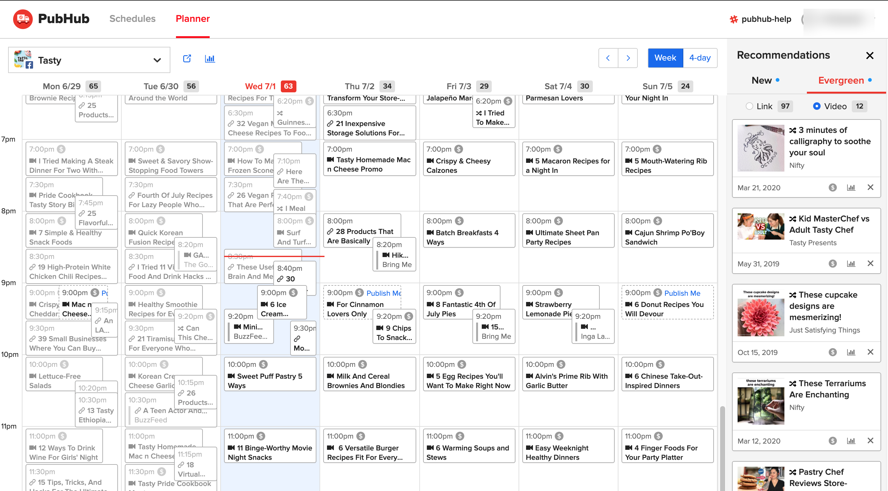
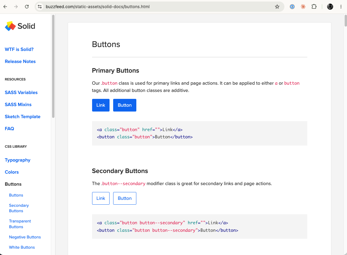
- The migration (2020): moved PubHub off Solid, BuzzFeed's internal style framework, onto Bootstrap. That groundwork mattered beyond our team — internal tools officially moved off Solid, with other teams following.
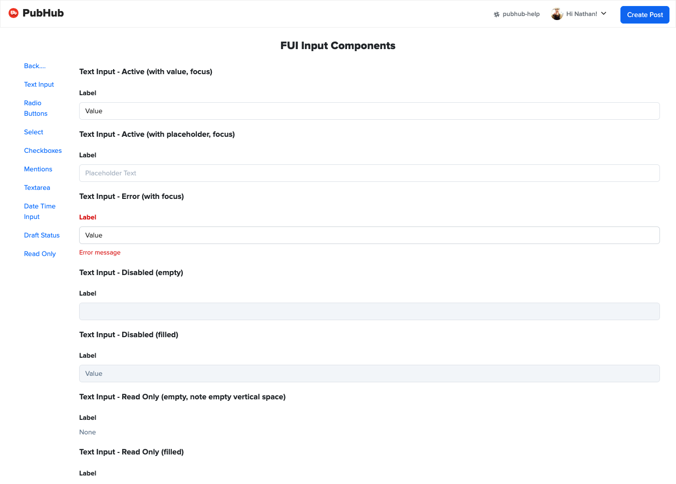
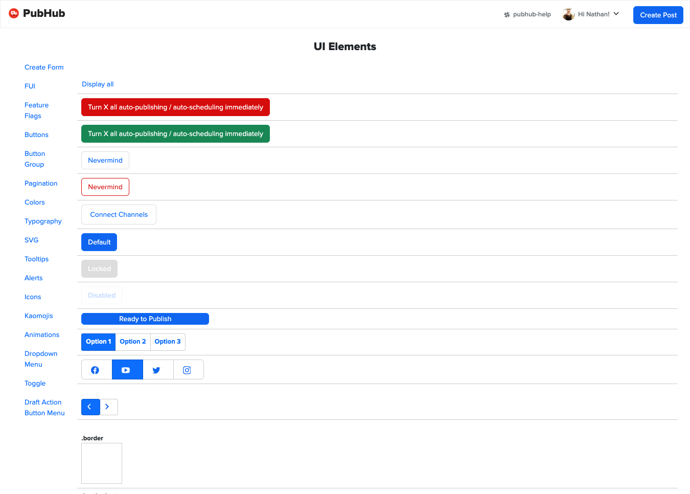
- Foundation UI (2021–2022): a redesign of the post-creation surfaces that standardized form inputs and page patterns into a reusable toolkit — designed by our product designer and implemented by me on the Bootstrap foundation I'd led the team onto, carrying the build with our PM and QA.
- The company component library: separately, I shipped 47 commits into BuzzFeed's shared `react-components` library — consumed by 79 projects (measured in the monorepo). My components ran where it counted: the callout render unit on the site's highest-traffic page, share components across nine properties, the subscribe button on the main feed.
How it works
A battle-tested base, and our effort spent on the delta. FUI builds on Bootstrap — it already handles most UX needs — so design effort went into our patterns, our form conventions, and our review rubric instead of re-solving solved problems. That choice is most of why it lasted.
- Kitchen-sink first: every new component was developed, tested, and merged on a kitchen-sink page before touching a real screen — a steady weekly cadence of shippable pieces.
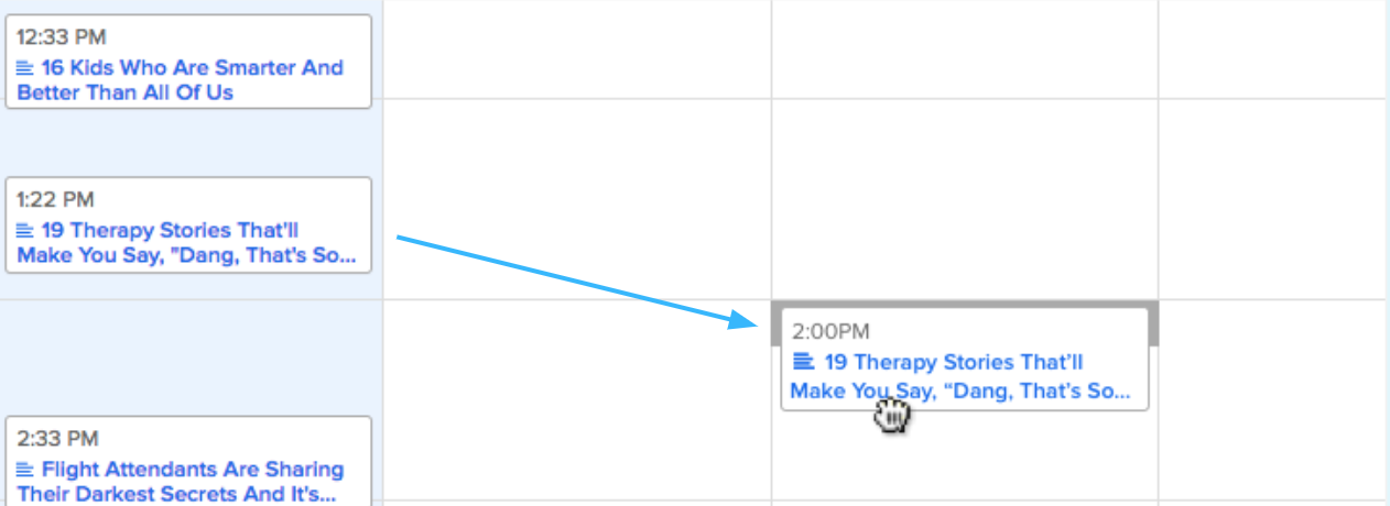
- Feature-flag rollout: pages adopted the system behind a flag, phased by platform (Facebook Video first, then the rest), so an eight-year-old production tool was re-foundationed in flight.
- Extensible at three levels: most new features used existing components as-is; some composed off them; and entirely new pages still worked within the system. The foundation absorbed novelty instead of fracturing under it.
How I built it
Process was as much of the build as code. We refined the design review process to put more upfront review responsibility on developers — design attention went to the calls that needed it. Our team's written design principles ("build trust in every interaction," "improve for efficiency") were the explicit rubric in design feedback, and significant changes ran through written RFC proposals with comment periods, which I reviewed.
I documented and coordinated the task breakdown across developers, worked with our designer on feasibility and phasing, and kept the schedule with our PM and QA through launch.
The honest cost of a versioned library: shipping a shared-component change meant a version bump, a publish, then updating and deploying each consuming service just to test it — sometimes three services for one change. Living that loop for years is exactly why I later built Sorb, which previews a proposed change in the running app with no publish-deploy cycle at all.
Questions this project answers
What makes a design system last? Extensibility you can name. FUI held for four years because most features could use it as-is, the rest could compose off it, and even brand-new pages stayed conformant — and because the base was boring on purpose. Choosing Bootstrap and spending our design budget on the delta beat rebuilding solved problems for novelty's sake.
How do you retire a legacy system without a big bang? Migrate the foundation in flight: kitchen-sink the components, flag the pages, phase by platform, and let results recruit the rest of the org. Solid wasn't decommissioned by decree — teams moved off it because the replacement was visibly better to build on.
How do you run quality without a formal design-system council? On the path I worked, peer review was the gate — so the tooling had to carry the governance: scaffolded components with tests, Storybook stories, and README templates by default, written principles as the review rubric, and RFCs for anything significant. Convention did the enforcing.
What does "reach" mean in a component library? Two different things, and it pays to know which you have. My callout render unit had two consuming projects — and the most traffic in the company, because one of them was the main content page. My share components had nine consumers across every property type. Depth and breadth are different kinds of leverage.
Results
- FUI remained the working standard for 3–4 years with no rewrite — and when new draft types arrived (TikTok video, Facebook Reels, Instagram Reels, Instagram Carousels), they shipped quickly because the toolkit existed.
- The Solid → Bootstrap migration spread beyond our team: internal tools officially moved off the legacy framework.
- The users had a voice on record: the team ran satisfaction surveys on a six-month health-check cadence (110 responses at peak), and the platform scored 95% user satisfaction in its final years.
- Peer review on the record: "Nate really excels in technical execution — he takes large projects, breaks them down into chunks, and implements them to completion." — my team lead.
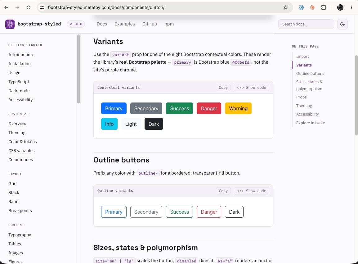
Browse the components: Foundation UI Storybook · bootstrap-styled docs, the open-source successor to the layer underneath.